
I decided to look
at Oasis as they are a band that have been around for many years and have released several albums.
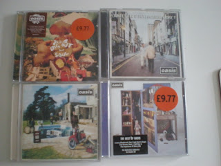 I Started out by looking at the front of them. The four album covers that i looked at do not have any images of the band members on them.
They are all very 'odd' im
ages looking a bit 'random' if you look at them like they are just photographs that have been taken.
As my band are a new band and this is their first
album i am going to have the images of them on there.
As you can see aswell, the name of the band 'Oasis' is the same font and style/ima
ge on all four of these albums giving the band a 'logo' image.

Looking at the back of the covers they are very different to the front.
Obviously, you have the barcode, and all the copyright ect.
The images on the back reflect the image on the front of the covers. They aren't just black on the back with writing.
The top left hand cover's image is very arty and that is represented throught the writing of the song titles through it's hand written style.
Whereas the rest of the covers song titles look typed.
I would like to use the style of the top left hand cover as i think that style fits in with the image and representation I am trying to create for my band.
No comments:
Post a Comment