Sunday

Evaluation

n what ways does your media product use, develop or challenge forms and conventions of real media products?

For our music video, we chose the genre 'Indie'. The average forms and conventions within a music video for this genre consist of a band, and a basic storyline to fit the lyrics.
The band is a key element of the conventions within this genre, as most if not all Indie bands are more than two people. Our band follows this as FUDGE consists of four band members.
Our band, also follows the conventions of the Indie stereotype; Skinny jeans, long hair etc.
Our video does not tend to challenge the forms conventions of the Indie genre. Our video has no special effects on it as our video is very basic and that was the idea and look we wanted to go for from the start.
It has a simple storyline and flows well. It may be simple but it is very enjoyable and eye catching. Our main aim for the project!


How effective is the combination of your main product and ancillary texts?
For my album cover i decided that i wanted to use a lot of colour especially block colour. I chose to use the outline of the band members and fill them with block colours. This created a very bright and fun feel for to band through the album cover itself.
I developed this idea from the Blur cover.
I think this fits in well with the way the band are presented through my music video. I think the band are presented as fun loving people.
The video has a very bright feel about it, especially the storyline scenes! The hand held shots create a realistic effect for the viewer.
I feel my poster, album cover and music video tie in niceley and the ancillary texts do not look out of place in contrast to my music video.

What have you learned from your audience feedback?
I have learned alot from my audience feedback. It seems very 'wierd' when your whole ideas and effort has been put into the making of the video, all the group discussions and changes, but when someone else looks at your video and enjoys it, thats a very nice feeling of achievement!
We did have some critisims from various people too however, this was all taken into consideration and discussed and selected parts of the video were neatened up and tweeked.
I learned that audience feedback is key and as you may like your own ideas, if there is no audience that enjoys your video there is no band!
We were very pleased that the majority of the audience in our crit lessons had positive feedback!
Different peoples opinions and tastes are so important.
Whilst editing, we always had people coming over and watching and giving us feedback so it was always constant however, our crit lessons were the lessons where it was given to us more formally and from the teachers aswell as the students.

How did you use new media technologies in the construction and research, planning and evaluation stages?
For the early staged of my research and planning, i was using the internet as my prime source for information. Looking into record labels, using youtube as a source to watch music videos, research into Anton Corbjin!
For the editing process, we used imovie to edit together our rough cut and then transfered it into Final cut pro to have a go at using some split screens. We found it placed the video out of touch with the theme of simplicity that we was going for.
We used imovie to letterbox some of our shots and found the editing process really interesting and it taught me alot about the construction and creating a story through the editing process.
I also used Photoshop to put together my album cover which i found really enjoyable as i love the print aspect to the media course.
However, i did not use photoshop for my poster promotion. I used a music promotion poster template on my mac to create this. As i wanted it to be simple i did not feel it a necesity to use photoshop for this.
I found new media technologies the key to the whole creation of my coursework as without these i would have limited research and planning and would not have been able to use photoshop and templates.

I have enjoyed this coursework loads and am very pleased with the outcome of my video, album cover and poster!! I hope you liek them too!

Thursday

digi pack

This is my album cover. I have used a 6 panel template as my band are under an independent record label 'Domino Records'. Only the mainstream record label have ownership of 4 panel record labels.
As you can see, i have chosen a colour scheme of red, blue yellow and green. This is because i feel my band are very fun and bright and i wanted to reflect this on my Album cover.


Poster 2

Monday

Target Audience and codes and conventions.

The genre we chose for our music video was 'indie'. We chose a song by an indie group 'mystery jets'. We looked at many of their videos to see how they construct them and what codes and conventions exist within their videos. We applied these to our, a very basic video with no advance editing techniques. A nice storyline to fit to the lyrics and characters that can have fun together and have a connection.
It's difficult to give a specific gender or age range or class to the 'indie' genre as it is rapidly becoming more mainstream with many indie bands reaching the top 10 area within the current music charts and many becoming number one, Kings Of Leon are one example.
For the style of music that mystery jets play and now 'fudge', a certain 'indie pop' style, the audience exists to whoever.

Finishedd!!

Our music video is done!! WOOOOOO!!

Crit.

So we had two crit lessons. One was with Leanne and the other with Nina.
Our crit with Leanne:
So we screened our music video of what we had so far. We have nearly finished editing however we have about five two second gaps we need to fill.
Leanne said she liked the idea however she thought the band scenes should have been filmed in a different location.
She also thought that the conept of the video did not fit with the song.

Our crit with Nina:
We had our crit with Nina and we showed her the same footage as Leanne.
Nina thought it was really good and she felt it looked like a music video promoting a film.
She thought the concept was very fresh and she loved the simplicity and basic look of our video and felt it worked well.

We was contemplating as to whether to put in split screens ect. however Nina said she thought it would make it look too 'profesional' and ruin the videos' creative and simple look.

We have taken all of our critisim and discussed what we thought is best to do with our video.
We have decided that the original idea and look we have developed was to make it very basic with an 'amatuer' feel.
Our idea has also been explained throughout all of our blogs and every idea has been explained as to why we are doing it.

More Editing.

So we have finished our rough cut and moved our video onto Final Cut Pro. Becky, Chelsea and I made a decision to add in some split screens to our video to give it a slightly faster and more up to date effect to it.
We had a training day in school so Chelsea and I came in to finish our editing and make some final 'tweeks' to it before we had our 'crit' session. However, when our video moved onto Final Cut Pro it had to be moved onto a different area of the computer as the memory was full on the other ones. So when we came in to do our editing we did not know the password for that area and the technision was not in that day and none of the teachers knew it either.
So we couldn't edit any that day and our video was not complete for our crit.

Editing...

So we are in the process of editing. We are editing together a rough cut at the moment on iMovie. We aren't going to be adding effects or anything at the moment as when our rough cuts done we will then transfer it onto Final Cut Pro and will then begin to add the effects we would like.
We haven't experienced any hiccups yet and we seem to have enough footage for our film.
The footage looks just as we planned with a quite edgy, hand held effect on it as we had hoped for.

Filming Complete!

So our filming is finished! We re-shot the band scenes using more light and they came out very nice. The footage was a lot more clearer and it came out with quite and orange/dark contrast to it making it feel more real and 'band-like'.
We also filmed our outdoot scenes. We filmed on a cold but sunny day which made the footage look lovely. It was also quite frosty out and we got some beautiful shots of the sun beaming onto the 'band members'.
Our storyline did slightly change a bit as we only have two locations which are the bedroom and the park.
We filmed the outdoor scenes more hand held to give it a more 'home video' effect so it contrasts with the indoor footage which is more steady and less 'homely'.

Sunday

Album cover stuff..

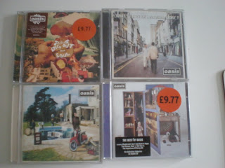
So i decided whilst doing some research into album covers to maybe look at a band and all of their album covers to see how they maintain a solid image.
I decided to look
at Oasis as they are a band that have been around for many years and have released several albums.
I Started out by looking at the front of them. The four album covers that i looked at do not have any images of the band members on them.
They are all very 'odd' im
ages looking a bit 'random' if you look at them like they are just photographs that have been taken.
As my band are a new band and this is their first
album i am going to have the images of them on there.
As you can see aswell, the name of the band 'Oasis' is the same font and style/ima
ge on all four of these albums giving the band a 'logo' image.


Looking at the back of the covers they are very different to the front.
Obviously, you have the barcode, and all the copyright ect.
The images on the back reflect the image on the front of the covers. They aren't just black on the back with writing.
The top left hand cover's image is very arty and that is represented throught the writing of the song titles through it's hand written style.
Whereas the rest of the covers song titles look typed.
I would like to use the style of the top left hand cover as i think that style fits in with the image and representation I am trying to create for my band.

The Video Shoot

So our first video shoot did not go as planned. To film we did used on of the schools hand held cameras also using a tripod. We filmed all of the footage of the band using various shots giving us about 20 minutes worth of footage. However, once uploaded on to the Apple Macs, the footage was slightly blurry and the lighting was a lot darker on the computer as to on the camera making out band members look like blacked-out silhouettes.
Therefore, we now have to re-shoot using a different location (as no more light was available at the original). That will be
done sometime this week.
We took some photos of the location ^^^